 TheTubeScape Home
Indev: TheTubeScape Forums 3.0 - Qonnect
2 posters
Page 1 of 1

What do you think of this update?
Indev: TheTubeScape Forums 3.0 - Qonnect
![]() by TheTubeScape Sat Oct 23, 2010 6:57 am
by TheTubeScape Sat Oct 23, 2010 6:57 am
An image of the future:
Currently, TheTubeScape is in 3 parts. The channel, the site, and the forums. Forums 3.0 was a project to combine the website and forums together. Now, I will attempt to unite, combine, and connect the channel to this. This is 3.0 Qonnect (Connect), or 3.Q. How will this work? Well, to do this the channel will need partnership. This is likely impossible, but you never know the possibilities. After all, this is just a concept. The channel's background will look extremely like it is a page from the website. It will have the banner, and the navbar linking to other pages (it will be slightly different than the website one, it would say "Home, YouTube, Forums, Twitter, Facebook, TTSX", or something along those lines. The main background will be the dark stripes, with a white box for all the writing. For certain parts, (videos, comments, subscriptions) I will make those 'widgets' - in that they will have the blue bubble with a name. I will come up with an image shortly.
With TheTubeScape 3.0 came a brand new forum look, and even though it looks a bit better, there's so much more we can do.
At the moment, the visuals are a bit all over the place, and I planned to change that. When 3.0 came out, I planned a major overhaul which would have the same layout, but a VERY different look. The current design was meant to be named Forums 3.0 (to match the site name(, but has now been called 2.0 as it wasn't major enough to be called a 'whole new level'.
That never happened, and in a sense, I'm glad it didn't. I was thinking today of another redesign, and I came up with something quite nice which would make the forums and the site one thing. It has the site's style, and is very themed and has colourful aspects. Here's a brief design concept. It's kinda un-neat and rushed, but if this update goes forward I'll change a few things.
A lot of features are missing here, so don't worry.
Original 3.0 concept (June 2010):

Current 3.0 concept (October 2010):
Current design (October 2010):

Original design (pre-June 2010):
[
I am very strong with this idea. If I can find a good designer that can make this happen with no problems, I'd be really appreciative. I don't expect it to come any time soon, or ever for that matter, but we'll see With this, I'd hope to remove the 'omgforum.net' and just make it 'thetubescape.co.tv/forums. This design would be 'embedded' into the main site.
Currently, TheTubeScape is in 3 parts. The channel, the site, and the forums. Forums 3.0 was a project to combine the website and forums together. Now, I will attempt to unite, combine, and connect the channel to this. This is 3.0 Qonnect (Connect), or 3.Q. How will this work? Well, to do this the channel will need partnership. This is likely impossible, but you never know the possibilities. After all, this is just a concept. The channel's background will look extremely like it is a page from the website. It will have the banner, and the navbar linking to other pages (it will be slightly different than the website one, it would say "Home, YouTube, Forums, Twitter, Facebook, TTSX", or something along those lines. The main background will be the dark stripes, with a white box for all the writing. For certain parts, (videos, comments, subscriptions) I will make those 'widgets' - in that they will have the blue bubble with a name. I will come up with an image shortly.
With TheTubeScape 3.0 came a brand new forum look, and even though it looks a bit better, there's so much more we can do.
At the moment, the visuals are a bit all over the place, and I planned to change that. When 3.0 came out, I planned a major overhaul which would have the same layout, but a VERY different look. The current design was meant to be named Forums 3.0 (to match the site name(, but has now been called 2.0 as it wasn't major enough to be called a 'whole new level'.
That never happened, and in a sense, I'm glad it didn't. I was thinking today of another redesign, and I came up with something quite nice which would make the forums and the site one thing. It has the site's style, and is very themed and has colourful aspects. Here's a brief design concept. It's kinda un-neat and rushed, but if this update goes forward I'll change a few things.
A lot of features are missing here, so don't worry.
Original 3.0 concept (June 2010):
Current 3.0 concept (October 2010):
Current design (October 2010):
Original design (pre-June 2010):
[
I am very strong with this idea. If I can find a good designer that can make this happen with no problems, I'd be really appreciative. I don't expect it to come any time soon, or ever for that matter, but we'll see
With this, I'd hope to remove the 'omgforum.net' and just make it 'thetubescape.co.tv/forums. This design would be 'embedded' into the main site.Last edited by TheTubeScape on Thu Oct 28, 2010 9:28 am; edited 3 times in total

TheTubeScape- Administrator

- Posts : 426
Join date : 2010-01-28
Location : England, United Kingdom -


Re: Indev: TheTubeScape Forums 3.0 - Qonnect
![]() by Mtvnoob Sat Oct 23, 2010 10:26 am
by Mtvnoob Sat Oct 23, 2010 10:26 am
Hmm.... the 3.0 current concept looks very unique! i say we go with it if we can! 

Mtvnoob- Moderator

- Posts : 249
Join date : 2010-01-31
Age : 27
Location : Georgia -
Re: Indev: TheTubeScape Forums 3.0 - Qonnect
![]() by TheTubeScape Sat Oct 23, 2010 11:17 am
by TheTubeScape Sat Oct 23, 2010 11:17 am
Yeah, I will, if I can find someone that will help me make it happen
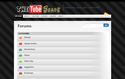
I've also added the Calendar and FAQ links etc to the page, as well as a quick login area. The concept is only for the homepage for now, but if the update goes forward I'll have to plan the other pages.
I'm currently adding the other features, and I'm thinking of making the categories' name as a light blue colour, so that it's a link. I think it could look quite nice.
Here's the final image:
https://2img.net/h/i280.photobucket.com/albums/kk184/deathskill/Forums3-1.png
Just so you know, everything will be less squished. The categories box will be moved down and the Quick Login will be moved to the bottom of the page. There will only be a link at the top.
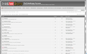
I've now created a concept of what the General category would look like. Until this update is 100% definite, no more concepts will be made.
Here's the image. If you click it, it feels like your actually on the page! Compare it to the current one?
I've also added the Calendar and FAQ links etc to the page, as well as a quick login area. The concept is only for the homepage for now, but if the update goes forward I'll have to plan the other pages.
I'm currently adding the other features, and I'm thinking of making the categories' name as a light blue colour, so that it's a link. I think it could look quite nice.
Here's the final image:
https://2img.net/h/i280.photobucket.com/albums/kk184/deathskill/Forums3-1.png
Just so you know, everything will be less squished. The categories box will be moved down and the Quick Login will be moved to the bottom of the page. There will only be a link at the top.
I've now created a concept of what the General category would look like. Until this update is 100% definite, no more concepts will be made.
Here's the image. If you click it, it feels like your actually on the page! Compare it to the current one?
TheTubeScape- Administrator
- Posts : 426
Join date : 2010-01-28
Location : England, United Kingdom -
» Indev: TheTubeScape Phase 1.5 Pre
» Indev: TheTubeScape 2.5 (Pending > Support Lack)
» Welcome to the Forums!
» TheTubeScape 3.0
» TheTubeScape 2.0 Original is no more.
» Indev: TheTubeScape 2.5 (Pending > Support Lack)
» Welcome to the Forums!
» TheTubeScape 3.0
» TheTubeScape 2.0 Original is no more.
Page 1 of 1
Permissions in this forum:
You cannot reply to topics in this forum|
|
|